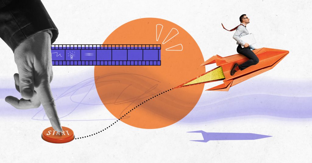
Graphic design goes to the core of contemporary advertisements, and in 2024 remains a core component as firms seek to reach out to audiences better. As digital marketing grows, graphic design now wholly encompasses the aesthetic, content, and call to action in an advertisement rather than just the aesthetics. Graphic design helps advertisers to reinforce branding, gain attention, communicate effectively in a number of ways, and finally influence their clients to convert, all while staying relevant for concepts like motion graphics, interactive design and sustainability.
As stated before this blog aims at dissecting how graphic design influences advertising with specific areas being focused on in 2024. Also, we will discuss how budding graphic designers can prepare themselves for the graphic designing job requirements that are taught from the best graphic designing courses offered at the leading IT training institutions.
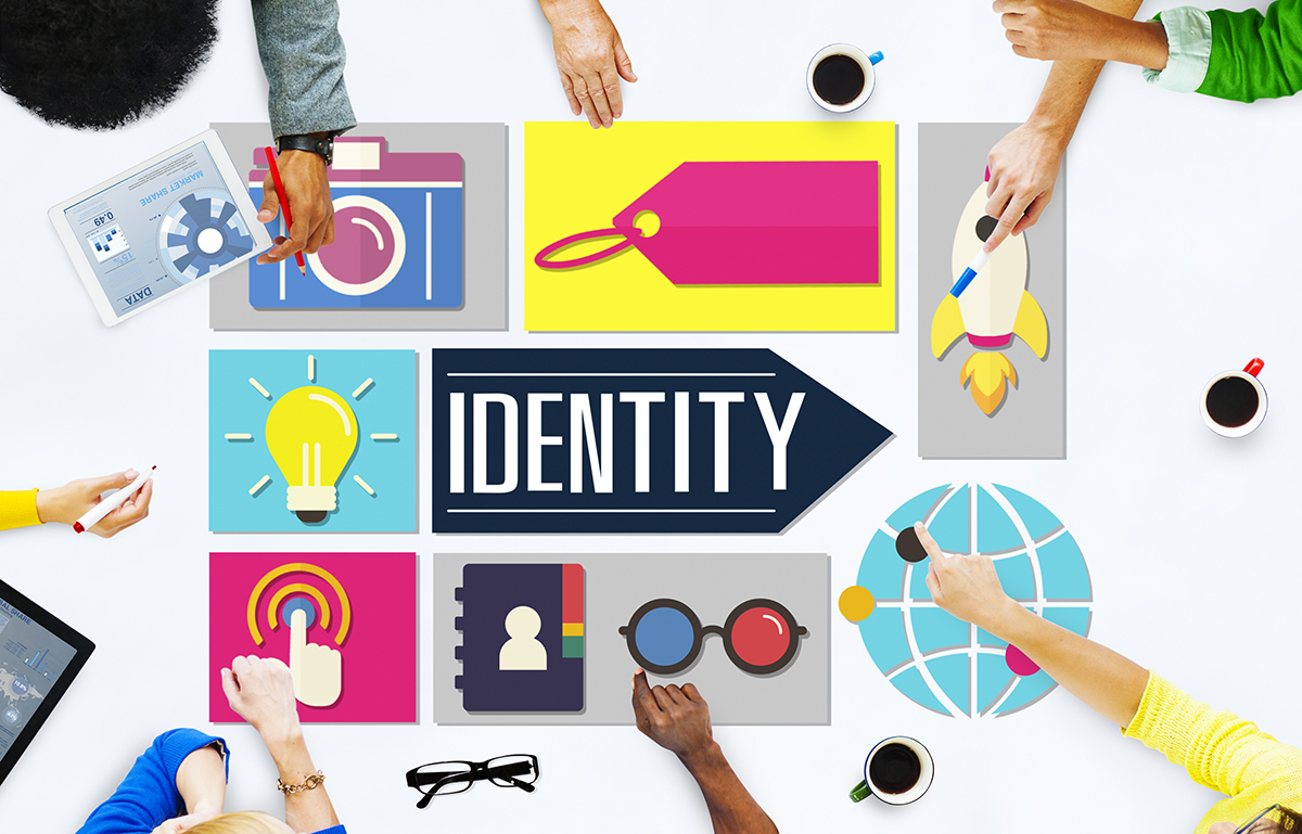
Brand image is the total sum of elements with which a brand is associated and through which its position and personality in the minds of the consumers are represented. This identity forms the way that consumers thinks of the brand and thus determines their actions, making it a foundational part of any advertising strategy. By 2024, due to immensely rigorous competition across industries and continual inflow of content in the digital sphere, having a clear, effective, and coherent brand image is paramount. Graphic designing is crucial in developing and sustaining and even reinventing this identity of the brand while making them easily identifiable, consistent, and easily memorable.
Matching these appearances to the different contexts is critical all in an effort to ensure that the brand is recognizable across the brand touch points. When a consumer approaches a brand on one platform be it through the brand’s social media accounts, visiting the brand’s website, receiving emails from the brand, or seeing an advertisement on a billboard, they expect to see the brand in all those forms. Graphic design also maintains the Web ID by making sure the design components of the logo, typography, color pallet, and imagery are reproduced in all forms of promotion. It makes the customers to familiarize with the brand and this makes it easier for them to interact with it.
Although continuity is relevant, it is just as crucial for a brand to be unique in comparison to its competition. It seems that brands get differentiated mainly through their unique visual style and palette. According to the survey made by Marketing insider in 2024 consumers are being fed with an enormous amount of content through different channels. For attention to be gained, a brand must create an essence that would encourage attention to be paid to it. This uniqueness is shaped by graphic designers regarding the brand, its values, objectives, and customers, then converting to unique symbols.
Example: Starbucks – Consistency Across All Platforms
Probably the most convincing example of appropriate consistency in the symbolic aspect of the brand’s image is Starbucks. With the visual emblem dating back to 1992, the green horned mermaid represents the company identity associated with environmental friendliness, communal spirit and high quality coffee. It is just that it is done exceptionally well at Starbucks : that sense of the logo is maintained, whether the customer is physically present in the store, watching an ad on Instagram, or ordering through the Starbucks app.
In the year 2024 also Starbucks remains loyal to the brand image and their designs are coherent and purposeful. Such an emphasis placed on the uniformity works to maintain and strengthen the customer base and guarantees that Starbucks remains one of the most easily recognizable companies in the world.
Surrounding the essence of any good advertisement there is always a matter of conveying a given message in the least amount of time. Powered by the technology, graphic design has never been more important: with a wealth of options and decreasing time people wait to consume content. Because the ads are fairly brief, the information has to be conveyed in the form of visual images to prompt a fast perception, elicit an emotional response, and tell viewers what action is required of them or expected from them. In this scenario, then, visual communication in 2024 can be better understood in the context of clear, fast, and effective graphic design.
Stores target their consumers through internet posts, emails, and advertisements, what they see, in-between what they read, even what pops up on their apps. Experts have estimated that the human attention span has reduced over the last decade, thanks to the barrage of information that comes with technology. As a result the messages they have to convey their commercials within the briefest possible time – within a few seconds usually. Graphic designs is unique equipped to rise to this challenge that because it is capable of taking complicated information and was them in a package that is both informative and pleasing to the eye.
In a way, this is good because when designing a visual image for an ad, one can be sure that even when one only attends to the ad for a short time, he or she will grasp what the ad is about. This relates to the use of graphic design features, wherein existing or injected visual content follows a design flow, guiding the eyes to follow, highlighting important details, and eliciting the appropriate emotional response.
In fact, understanding and implementation of the visual hierarchy forms the very basis of graphic design especially in the advertising industry. It is the process of organizing graphic items in a specific manner to show their significance and determine where the eye initially moves, where to pause and follow a chosen sequence. In 2024, the contrast ratio must be defined clearly, so that main messages could be delivered in the first glance.
Thus, graphic designers make sure that the viewer’s path through the advertisement is unidirectional and easy to follow. All these make the design elements effectively direct attention to the core facets, allowing the consumer to understand the key message even in areas of high interference or swift motions.
Typography is not just about picking a typeface, it is about the way that we arrange type. In advertising, typography plays a dual role: it improves usability, but it also helps to enforce the branding concept and signal the right emotional state. Typeface plays perhaps even a more significant role in the perspective of an advertisement and in the interpretation of what is being actually communicated in an advertisement.
Tone and Emotion: Typography can help to convey a brand’s character and the sentiment behind a particular statement. For instance, a sharp and an aggressive typeface such as modern sans-serif can signify innovation and confidence that is adopted by tech firms. Whereas a rounded serif font looks cultured, classy and trustworthy, it can be used for brands in the line of luxury or financial, among others.
Readability: For all that design is about beauty and creativity, function cannot and should not suffer for it. Typography should however be legible these being the modern common forms of advertising which include; billboards, digital banners, mobile ads, etc where the consumer hardly spends a considerable amount of time. Graphic designers also select typefaces that suit the medium as well as are easily legible for individuals and in different device.
Typography is, therefore, the art of getting it just right as far as form and function are concerned. Mastering the choice of fonts and knowing when and why it is appropriate to use them, graphic designers can make an ad more effective in its mission of evoking emotions while not losing the reader.
In advertising, color and imagery are useful assets that are used in delivering messages within the shortest time possible and in a way that is memorable. Colors create feelings and perceptions, images convey thoughts which it might be hard to express in words. Graphic designers in 2024 still take advantage of the psychological properties of color and the aesthetic value of images to improve the impact of advertising.
Color Psychology: People relate close and distant colours with specific feelings and it can actually affect consumer’s attitude towards a particular brand or product. Advertisement combines the right hue and shade, and this makes it not only get noticed but also elicit the right feelings.
Imagery: Pictures, illustrations, graphics are crucial elements in order to make the ad creative and to attract attention of a potential customer. It is shocking how a single picture can convey a message that perhaps when typed in a few paragraphs might not easily pass across. For instance, an ad for travelling may contain a stunning photograph of a travel destination to encourage the given audience to pack a suitcase and go on a trip. Imagery used should always be relevant to the corporate identity of the brand as well as the messages that the brand wants to convey.
Example: Google’s Effective Visual Communication
A good example of a company that brings graphic designs to life is Google. They have social media accounts and advertisements that have numerous features, which are clear and provide the public with a clear message to act accordingly.
We can learn from Google’s design method on how graphic design can help be used to improve the layouts of an advertisement and make it easy for the viewers to understand a particular message irrespective of the channel used.
By 2024, the thing that has turned into one of the main weapons in advertising is the ability to touch people’s emotions and experiences. People have a desire to associate with a brand that evokes an emotion such as happiness, confidence, familiarity or motivation. Emotional appeal does not only involve advertising products or services; it concerns itself with invoking feeling and principles in people. Graphic design is instrumental in creating these experiences since it involves using features like color, form, images and font to generate the right feelings. By so doing, the advertisers connect with the relevant psychological buttons that lead to decisions hence making the advertisement beautiful to the eyes and soul.
The first of the ten principles of story brilliantly captured by Herbert identifies is therefore the emotional involvement of the audience.
With increased competition, establishing a relationship through buyers’ emotions can sometimes be an edge in the competitive business world. Once the consumers have an emotional connection to the brand, they will just not fond of not buying that brand but even persuade others to buy it as well. Many of the brands that manage to tap into consumer’s emotions are likely to record higher customer retention and brand loyalty rates. Thus, graphic design becomes an intermediary channel that allows for the formation of associations with the further formation of a particular brand image.
One of the main reasons involves emotional engagement while in the context of the year 2024, the issue of consumer authenticity is in focus. If it’s by advertising that speaks about the care for the environment or launched campaigns that voiced out about equality or social justice, brands are capable of establishing long-term connections due to the formation of emotional connections.
Color psychology might be considered one of the most powerful methods in engaging emotions through design. Effect of colors on human mood and conduct Color are known to elicit strong feelings in human beings. Various colors stimulate certain emotions and moods, and these affect the consumer’s perception of an advert and, consequently, the brand associated with it. Through choosing particular colors graphic designers aim at achieving the desired emotional response of the audience.
By understanding the psychological effects of colors, designers can influence the emotional tone of an advertisement and guide the audience's reactions in subtle yet powerful ways.
Emotional appeal of an advertisement can be easily understood as to how imagery is used in reaching the audiences. We are a visual species, and images related to our experience, aims, and feelings will always be close to our hearts. By the year 2024, there will be a great shift in the kind of images used in advertising, these being images that tell a story that the consumer can identify with or one that is motivational. Like any other element, image selection is done with consent and a purpose; it can be to induce a feeling of joy, prompt empathy, inspire or build trust.
Human Faces: The pictures of people are some of the most persuasive tools that can be applied in emotional appeal. It has been found that advertisements containing human faces are more effective in gaining attention and evoking an emotion. For example, happy faces will make people feel happy and warm in some kind of way, while people struggling with problems may make others feel sympathetic or motivated.
Real-life Scenarios: Appealing to basic emotions makes the consumer identify with the advertisement since it shows scenarios they can understand. This approach can lead to the development of a better emotional bond because it gives the viewer a mirror image of themselves. Familiarity emotions include happiness and desire experienced when watching commercials that depict families, outings or people pursuing various objectives.
Powerful Storytelling: However, great imagery is always a part of some or the other larger picture. Brands are employing emotion strategies through visual storytelling in the year 2024. Whether it is about the narration of an event in a sequence of pictures or a single snapshot or a drawing or painting, whether it is about capturing something or portraying something.
Shapes and Forms: Subtle Emotional Influences
Beyond colors and images, the shapes and forms used in graphic design also have an impact on emotional engagement. Different shapes elicit different feelings and perceptions, making them a subtle yet important part of design psychology. Advertisers in 2024 are using shapes strategically to align their designs with the emotional tone of their message.
As it was mentioned before, typographical approach does not only help to make the text as legible as possible but also establishes the emotional background of an ad. Like color and images, the style of the font used can elicit feelings of a certain type to the readers. The font type that can be used include a flowing, elegant script which will make the readers feel that the product is luxurious and sophisticated or a bold sans-serif font which gives the readers a feeling of modern and strength. Specifically in 2024, graphic designers are considering subtlety and mindful in using typography for effective appeal to emotions.
Example: Nike’s “Just Do It” Campaign
Nike’s “Just Do It” rebranding represents probably the best use of emotional appeal in graphic design out there. The campaign merges several powerful graphic features which stimulate passionate feelings of motivation, inspiration and encouragement. The effectiveness of such strong contrast and large-size photographs of athletes and their activities speaks about the strength and success of breakthrough. Such imagines associate feelings such as determination, ambition, and pride with the brand hence creating an immediate link between the brand and the consumer.
All in all, integrating these design elements Nike has formed the emotional appeal that at the same time makes people buy their products and turns them into loyal customers.
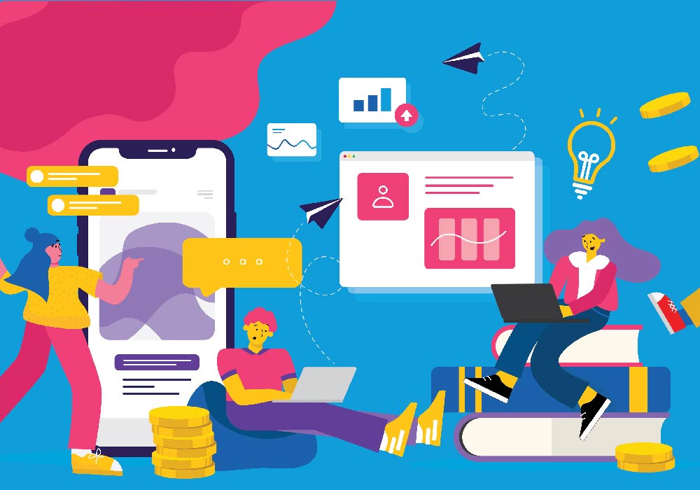
Looking at the year 2024, the scenario is much more complicated and diverse as the major shift has been witnessed under the banner of digital advertising world. Interacting with brands, consumers use social networks, mobile applications, and websites simultaneously, and often within split seconds. Consequently, the position of graphic design has expanded and adapted to fit this cross-platform, immediately digital landscape. Graphic designers now need to make sure the graphics they develop are both attractive and usable on small as well as large devices. This means that in an advertising campaign, the design must be easily transitioned across various media and should give users an engaging experience.
Thus, graphic design is pivotal to reach out and engage the audiences on digital platforms in a contextualised and efficient manner when a brand needs to stand out in a noisy and extremely competitive environment. It is a requirement that designers have to take into account the size of the screen, the specificities of each emerging platform, as well as the preferences of the viewer in order for the visual message to actually be effective, clear, and relevant to the chosen medium.
The Multi-Platform Challenge
Indeed, digital advertising today can stretch across various devices, not only desktop web, but mobile web and applications including Instagram, TikTok, YouTube, Facebook, and Twitter (X). All of these platforms have their specific design norms, user actions, and system requirements. This fragmentation of platforms poses a significant challenge for graphic designers: they have to design images that are appealing to audiences and functional on any digital platform and stage.
As with 2024, designers need not only to create interfaces for one platform or format but need to merge several formats into one single interface. This is an important consideration for designers to ensure that they know how they can create visuals that are useful in differing contexts and forms of media while still preserving the organization’s image. This needs expertise in the trends of the platforms, the User Interface (UI) and the User Experience (UX).
Responsive Design: Effective Interaction on Different Screens
Among the most significant features of the field that concerns graphic design in the context of digital ads, the significance of having responsive design cannot be overstated. Responsive design provides a proper layout and usability of an advertisement regardless of the accessed device; be it a large computer monitor or a small-sized smartphone screen. Based on the fact that many people are accessing internet primarily through mobile devices, designing for mobile first is norm in 2024.
Responsive web design does not only refer to how images and websites are reduced to fit the screens but more importantly, it is a way to analyze how users work with the content on various gadgets. For example, people who are using the mobile devices might only need short and graphic messages while those who are using the desktop may be willing to see the extended messages.
Social networks are considered one of the main trends in the field of digital advertising today, and each platform is designed for specific forms and has its own features of the behavior of users. Graphic designers should consider these subtleties when developing content for the platforms like Instagram, Facebook, Twitter (X), TikTok, LinkedIn, Pinterest.
Instagram: Instagram is very much visual and the content posted must be very appealing in a way that anyone who comes across the feed will stop to look at it. The platform favors square (1:Used on every website, in the news feeds or social platforms, it is important for a designer to come in formats, both horizontal (16:9 or 3:2) and vertical (4:5 or 9:16) images and videos. Also, the grid view of the brand on Instagram should be balanced as many people look for a specific aesthetic from a brand on IG profiles.
Example: One of the best examples of how Instagram content should be created is Glossier – a beauty brand. The most noticeable aspect is that they both post using a soft pastel color palette and the design is minimalistic, not saturating the viewer. Regardless of whether it is a simple product photo, or a post dedicated to bright and catchy user-generated content, the design unobtrusively complements other materials that represent the brands it handles, successfully capturing the target audience.
TikTok: Since TikTok is a short-form video sharing app, ads and content in such a platform must be swift, spirited and lively. When designing an advertisement for TikTok, graphic designers should think through how moving graphics, texts, or changing visuals can catch the viewer’s attention in less than a handful of seconds. TikTok’s vertical video format (9:16) As such, designers must also ensure that they are always designing content that is first geared towards mobile.
Example: Companies, especially the technology-based ones like Apple, have continued to benefit from TikTok by placing appealing, quick, and colorful clips that contain bright colors, heavy type, and animation. These are mobile-friendly ads intended to attract the user’s attention within the first few seconds during their browsing.
Facebook and Twitter (X): The two platforms also support different kinds of advertisements such as horizontal, vertical and square images as well as square and vertical videos. Nonetheless, Facebook and Twitter ads contain more text than just the image, therefore, it is important for designers to ensure that the work they do is in harmony with the text and equally stands out from the text.
Example: A brand that is launching a new product might use multiple images on Facebook, where a carousel might be used to showcase different features of the product and similarly, single images or videos on Twitter with a CTA and short and snappy line to go with it.
Knowing the ad specifications on various social media platforms can go along way towards helping minimize the impact of ads on users while maximizing user engagement. This means thinking about the specific dimensions of each platform, the acceptable aspect ratios, the numbers of characters, and remaining in tune with current trends on the social media platforms.
Video Content: The Future of Digital Advertising
In 2024, video content has become one of the most crucial components of digital advertising with YouTube, TikTok, Instagram Reels, and Facebook video as major stages. With the onset of consumers’ interactions with video content, graphic designers have to provide appealing visuals that fit within the motion graphics narrative framework.
Example: Glossier’s Success in Multi-Platform Advertising
Actually, one of the most successful brands, which can be easily noted with the help of the Internet, is Glossier – a beauty company. With an impeccable eye for aesthetics and an increasingly strong content frequency, Glossier has created an effective and engaging account across Instagram, TikTok, and their own website.
Thus, Glossier ensures the brand identity is composed visually continuously and the content is optimized for each platform’s conditions to become a recognizable brand and providing the consumers with a good experience of interaction with the company.
By 2024, motion graphics and animation have been crucial assets, which enable one to grab and sustain the attention of the audience within the context of the highly technological societies. Since people are consuming more content on their mobile devices, social media and streaming services, simple graphics and images do not get the attention of today’s audience. By incorporating motion graphics and animation, an ad can be enhanced and the material can be made as lively as it can be engaging, memorable, and influential. Whether it is an animated logo or a video that explains the product, an animated advert or simply an advert in a website, motion graphics in advertisements give the adverts a life that still images can never give.
With TikTok, Instagram Reels, YouTube, and streaming capabilities, the obvious future of digital advertising is in motion. Graphic animations and motions have become popular among brands for use not only as eye-catching promotional tools but as a way of communicating large amounts of information in a short span of time. It is a powerful tool that uses motion, sound, and display to help elicit emotions and support narratives on top of creating a lasting visual impact on the viewers.
Why Motion Graphics and Animation Matter
This form of animation is very important now that advertisers have a short time to influence the viewers. It has been established that as a human being, movement is likely to attract his or her attention more than when there is no movement. This would explain why motion graphics are perfect for use on social media platforms, advertisements, websites, mobile applications, and digital billboards. The incorporation of animation in an advert brings life and engagements to the visuals since people engage with them better when animated.
When motion is added to the mix, advertisers are provided with another avenue by which to engage their audience and elicit increased attention, memorability, and acquisition.
Animated Logos: Reviving Days of Brand Image
Another trend in 2024 is the employment of animated logos, which can be considered one of the most successful trends of the year. While the static logos are still useful, these are currently evolving or supplemented with their animated version that gives the brand element a motion, energy, and depth. Animated logos are more appropriate in today’s digital form such as on websites, applications, video ads, and on the social interact media since the movement tends to be more captivating.
The other relevant trend in the motion design for the advertisement is the existence of the interactive ads. The type of ads which are more engaging are the interactive ones where animations used prompt the users to click, hover or swipe in order to expose more content or launch animations. Not only does this level of interaction keep users engaged for longer but it also increases the chances of them engaging with the content and performing a call to action.
Motion graphics are commonly used in explainer videos, which is one of the most popular video formats for presenting concepts or procedures in a clear and entertaining manner. Such videos employ animations and this is because they give simple visuals and they are suitable for niches such as technology, finance, healthcare, and education.
Social media platforms are ideal for motion graphics since users barely take time to watch the content before moving to the next post. Motion attracts the attention of users to the content and makes them pay attention to it more often. People are employing motion graphics to convey creative messages in responsive adverts than stagnant images to capture the attention of the viewers and lead them to click on the links.
There is no better example of motion graphics advertising done perfectly than Spotify. Their commercials, for example, employ smooth motion graphic images moving in harmony with their main product, which happens to be music. For example, the social media ads for Spotify often depict bouncing sound wave, musical notes, geometric forms which vibrate and swell as the music achieves with melodies featured. This alignments the Visual and the Auditory seamlessly creating a healthy brand awareness of what Spotify is; a music streaming application.
Dynamic Visuals: The advert pictured here is that of Spotify which incorporate colors and movements that are action oriented mirroring the music platform. This kind of motion graphics helps its ads pop on users’ busy social media timelines and deeply connect with them on an emotional level, especially through beats and timing.
Interactive and Personalized: Some of the spotify ads are animated and the users can click at certain areas of the ad to find new artists or playlist. The inclusion of this interactive element give the advertising a thus making them more engaging to the users.
|
Key Trend |
Description |
Benefits |
Examples |
|
1. Strengthening Brand Identity |
Creating consistent visual elements (logos, colors, typography) to define a brand’s personality. |
- Enhances brand recognition and loyalty - Differentiates from competitors |
Starbucks uses consistent green logo and earthy tones across platforms. |
|
2. Enhancing Visual Communication |
Using layout, typography, and color hierarchy to effectively deliver advertising messages. |
- Guides viewer’s attention - Conveys messages clearly and quickly |
Google’s clean designs use clear visual hierarchy and vibrant colors. |
|
3. Emotional Engagement Through Design |
Utilizing color psychology, imagery, and design elements to evoke emotions and connect with audiences. |
- Builds emotional connections - Strengthens customer relationships |
Nike’s “Just Do It” campaign uses bold typography and high-contrast images. |
|
4. Leveraging Digital Platforms |
Adapting designs for multiple platforms (social media, mobile, web) with responsive and platform-specific visuals. |
- Ensures consistency across devices - Boosts social media engagement |
Glossier uses pastel colors and clean design across Instagram, TikTok, and more. |
|
5. Power of Motion Graphics & Animation |
Incorporating motion in ads through animated logos, interactive ads, and explainer videos. |
- Increases engagement - Communicates complex ideas quickly |
Spotify uses synchronized motion graphics with music to create dynamic ads. |
This table highlights the core trends, their unique advantages, and real-world examples of how brands are applying them in 2024.
Due to the importance of graphic design in advertising as seen above, any beginner in this field needs to ensure he or she is up to date on the tools in the market, the trends and techniques in use to secure a place in this fast-growing industry. The requirements for aesthetically pleasing engaging advertisements and advertisements placed in specific strategies and locations is greater than ever due to the continually evolving technology and consumer expectations. With organizations establishing more concentration on contemporary and progressive models in executing their operations, the demand for competent graphic designers has risen.
When you are looking for the options to gain new skills or improve the ones you already possess, there isn’t a better option than to turn to the best graphic designing courses. The design courses provide advance trainings in designing principles, computer software knowledge and latest trends in the advertising industry to make you professional as well as make you capable for designing attractive, effective and eye-catching advertisements for all digital and conventional mediums.
Graphic design courses cover essential topics such as:
Thus, learning at one of the best IT training centers will offer not only the opportunity to get practical knowledge from experienced trainers but networking and getting familiar with real projects as well. They usually ensure that you get a mentor and an opportunity to get a job that can make you grow faster. Moreover, a sophisticated course in graphic design will ensure that you are aware of the modern trends that are current in the market including the use of responsive design for digital media, creating social media graphics and using motion graphics in your ads.
Looking to the year 2024, the significance of graphic design in advertising has probably never been greater. In this context, graphic design becomes a key tool with which brands seek to demarcate themselves and build a more distinctive persona, communicate more effectively and emotionally with consumers. Aspects like typography, colors and motion graphics are crucial in the creation of ads that not only feature high aesthetic value but have the potential of exerting a profound impact on the business. As the use of the Internet becomes more widespread, graphic designers must incorporate their designs to suit different platforms, including social media and mobile applications.
Get more Info about training and Software